
Chen Shaohua, 1992
0
comments
![]() Labels
graphic design
Labels
graphic design


Kind of obsessed with the Celine SS2011 ads. I might be wrong but I believe they were done by Peter Miles shot by Juergen Teller. Don't quote me on that, but you know I love me some Peter Miles + Celine + Juergen Teller
0
comments
![]() Labels
graphic design
Labels
graphic design

Four color serigraph designed by design collective Heads of State
0
comments
![]() Labels
graphic design,
miami
Labels
graphic design,
miami

I'm joining a contest to redesign the logo for the Miami Marine Stadium. This stadium is an institution in South Florida architecture, and was designed in the 1960s by a close family friend. It would be really cool to win!
2
comments
![]() Labels
graphic design,
miami
Labels
graphic design,
miami
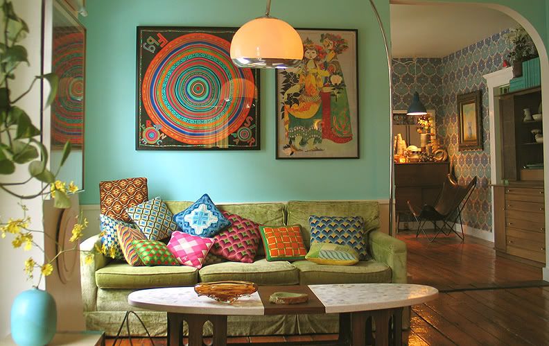
I came across this couple in a recent issue of Domino, and I suddenly had a big time crush. Linda Wary used to be a freelance art director (what a coincidence) and John Meyers went to Parsons (another coincidence) and headed the display departmentfor Anthropologie. They threw in the New York towel, and moved to Maine to start WaryMeyers Decorative Arts. They pretty much do interior design involving all things vintage. They spend just about everyday scouring flea markets, websites, estate sales, etc. and buy pieces they can't resist. When a client calls they go into their archive and resell. On the side she makes clothes and he paints and makes custom wallpapers. They also do set design. Can you see why I'm in love?
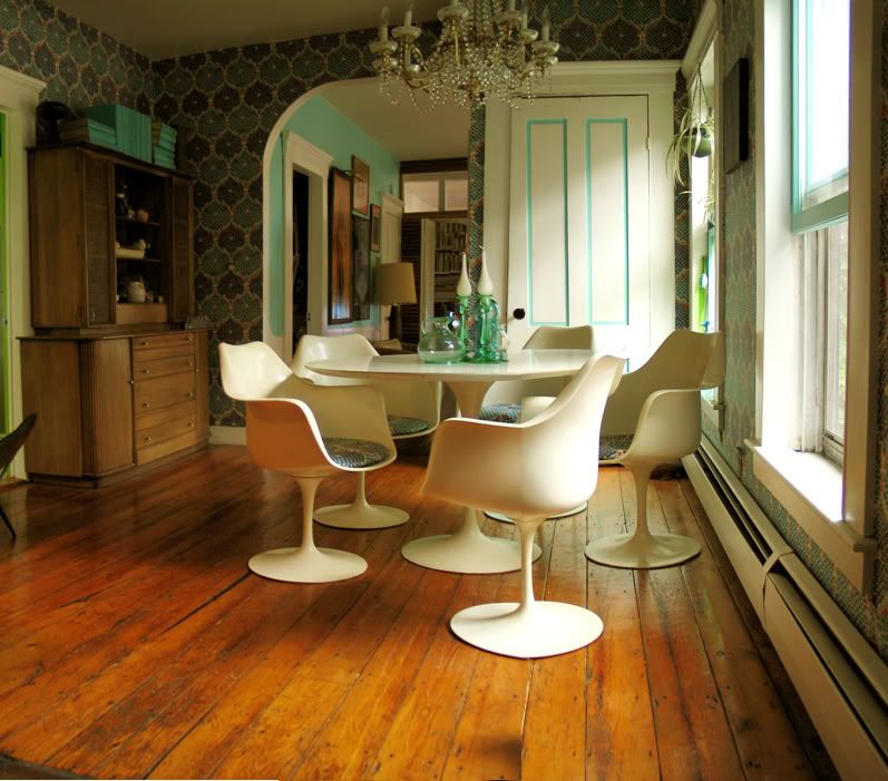
The dining room. Love the wallpaper.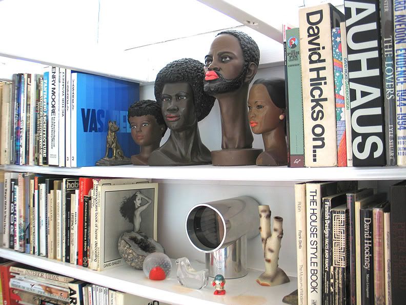
Great bookshelf. I need to start a quirky collection of some sort.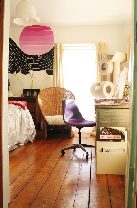
And a peek into the bedroom.
1 comments
![]() Labels
casa,
graphic design
Labels
casa,
graphic design
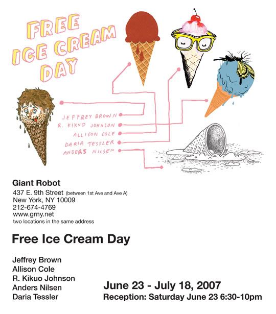
This looks like it could be interesting, too bad I'm in Miami for the next week. Someone go look!
0
comments
![]() Labels
go see,
graphic design
Labels
go see,
graphic design
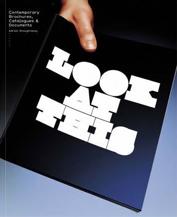
So our good friend Adrian Shaughnessy, who wrote the last book I mentioned, also just put this book Look at This: Contemporary Brochures, Catalogues, and Documents. It has amazing design work from Non-Format and a bunch of other people in Europe, here and Asia. It has a lot of pages, and a lot of pictures, and its ALL good stuff. Sometimes these design books get filled up with a bunch of crap and in between you get a garnish of something actually decent to look at, but this book I highly recommend. Its also refreshing to see that some "boring" clients actually do hire good shops to do beautiful design work for things such as annual reports. Anyway buy it or go sit at Barnes and Noble with some time and look at it thoroughly.
0
comments
![]() Labels
graphic design,
libros
Labels
graphic design,
libros
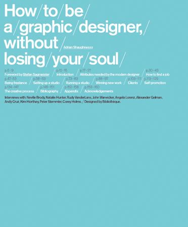
I picked up this book recently and read it on the plane. Adrian Shaughnessy is a British guy that started the design firm Intro, and now writes in all of our favorite design publications about the subject. This particular book is a quick but insightful read. I really like his tone and honesty, and his advice seems reasonable to follow. The book was designed by Bibliotheque, I like how the table of contents is on the cover, although lately I've been seeing that here and there. The Tiffany Blue book has an Intro written by Stefan Sagmeister, and each chapter is followed by interviews with some pretty well known designers like Neville Brody. It kind of makes you want to start your own design shop...which he doesn't suggest you do alone...Hmm...
0
comments
![]() Labels
graphic design,
libros
Labels
graphic design,
libros
Remember how much I loved the posters for Sophia Coppola's movies? Peter Miles Studio is responsible for those, the same group that do all the Marc Jacobs, Sophia's BFF, stuff. Its all making sense now, people don't go on hunts for the best talent in the world, they just go to their buddies for personal recommendations. I see it all the time at work. Go throught a couple of books, someone says "what about xxxxxxxx?" "Sounds good, tell them to get in touch with me" And that my friend is how talents spreads. 
Then again his work is pretty amazing, I would want him to do my logos and posters too, Oh my!
0
comments
![]() Labels
graphic design,
sofia coppola
Labels
graphic design,
sofia coppola
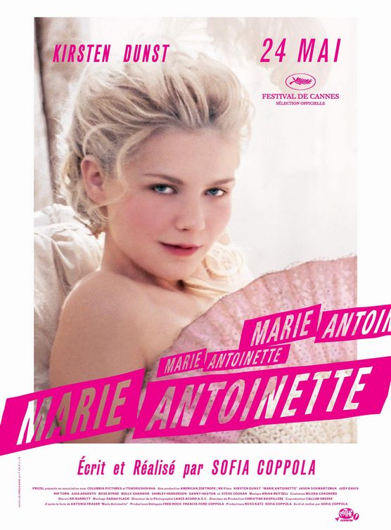
My room is disturbingly pink when I prefer black. My furniture is disturbingly boudoir when I prefer modern . My Marie Antoinette meets Eames complex was inflated a bit with Sophia's Coppola's latest film. The movie poster itself felt like a personal invite to go watch the movie, i thought the colors and type were very appropriate, and I couldn't have found a better solution to illustrate the soft feminity yet avant garde mentality belonging to such a unique royal. Outdated I know, the movie was so October, it definitely reached cult status way before it even premiered (despite mixed reviews) ... So in the spirit of Miss Antoinette, may I introduce GusGus, my 4 month old pug, the queen's favorite breed (hers was named Mops, mine was named after the chubby mouse in Cinderella) I opted for black instead of the traditional fawn. Go figure.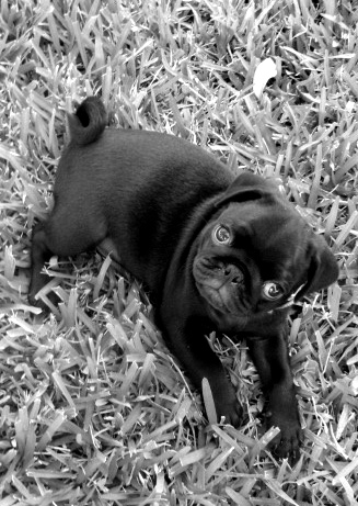
0
comments
![]() Labels
go see,
graphic design
Labels
go see,
graphic design


